HOT TOPICS LIST
- MACD
- Fibonacci
- RSI
- Gann
- ADXR
- Stochastics
- Volume
- Triangles
- Futures
- Cycles
- Volatility
- ZIGZAG
- MESA
- Retracement
- Aroon
INDICATORS LIST
LIST OF TOPICS
PRINT THIS ARTICLE
by Dennis D. Peterson
Semi-log charts can help you understand some of the Nasdaq composite price action.
Position: N/A
Dennis D. Peterson
Market index trading on a daily basis.
PRINT THIS ARTICLE
TECHNICAL INDICATORS
Nasdaq Change
09/15/00 10:48:57 AMby Dennis D. Peterson
Semi-log charts can help you understand some of the Nasdaq composite price action.
Position: N/A
| Semi-log charting helps analysts see constant rates of change. These constant rates of change are displayed as straight lines on a semi-log chart. A semi-log scale uses an equal length of y-axis scale for the same percentage increase in price. A change in price from 30 to 60 (100% change) has the same y-axis length as a change from 60 to 120 (100% change). |
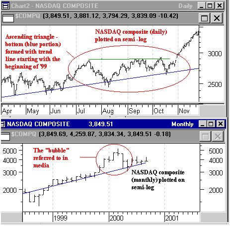
| You may have heard the media talking about the Nasdaq "bubble" in the first quarter of this year and wondered what it meant. It could well be the media was talking about a different bubble, for as often as I heard about it I never saw a chart depicting the bubble, but when you look at the Nasdaq plotted on semi-log there was a bubble. Starting in November 1999, the gains in the Nasdaq exceeded the constant rate of change that had been in effect since '96. In my previous posting about the Nasdaq, I made reference to the Nasdaq not wanting to exceed its normal rate of change. The case for this is the bottom chart of Figure 1. This may well be the bubble referred to by the media. Even if it wasn't, it was reason for investors to be cautious. I know I was. In fact, riding this Nasdaq up this spring was like watching over your shoulder for the train as you were running down the tracks. |

|
| Figure 1: Nasdaq daily (top chart) and Nasdaq monthly (bottom chart). The Nasdaq "bubble" referred to in the media at the beginning of 2000 is evident in this montly semi-log chart (bottom). The bubble is a set of price moves above a trendline. Straight trendlines on a semi-log chart show a constant rate of change. In fact, the bottom portion of the ascending triangle pattern (top chart) is nothing more than an extension of a constant rate of chage for the Nasdaq. |
| Graphic provided by: MetaStock. |
| |
| From the top chart you can see that prior to the big jump of the Nasdaq in November '99, an ascending triangle formed. What's the connection? If you draw a trend line at the beginning of '99 using daily Nasdaq on a semi-log chart, the bottom of the ascending triangle is simply the trend (Figure 1 - top chart). You now can see why coming up into an ascending triangle is such a strong pattern. Investors initially are very bullish about the stocks in an index. They jump the gun and push the prices above what's tolerable. When retracement comes it only goes down to the resistance formed by a constant rate of change. If the next move up is no further than the previous top, it had less distance to travel and expectation mounts. It's as if investors are saying, "I know that if I wait long enough the constant rate of change will validate the increase so why wait!" |
| Will it be deja vue again this November? I am looking and waiting. I think you know what I am looking for. |
Market index trading on a daily basis.
| Title: | Staff Writer |
| Company: | Technical Analysis, Inc. |
| Address: | 4757 California Ave SW |
| Seattle, WA 98116-4499 | |
| Phone # for sales: | 206 938 0570 |
| Fax: | 206 938 1307 |
| Website: | www.traders.com |
| E-mail address: | dpeterson@traders.com |
Traders' Resource Links | |
| Charting the Stock Market: The Wyckoff Method -- Books | |
| Working-Money.com -- Online Trading Services | |
| Traders.com Advantage -- Online Trading Services | |
| Technical Analysis of Stocks & Commodities -- Publications and Newsletters | |
| Working Money, at Working-Money.com -- Publications and Newsletters | |
| Traders.com Advantage -- Publications and Newsletters | |
| Professional Traders Starter Kit -- Software | |
Click here for more information about our publications!
Comments

Request Information From Our Sponsors
- StockCharts.com, Inc.
- Candle Patterns
- Candlestick Charting Explained
- Intermarket Technical Analysis
- John Murphy on Chart Analysis
- John Murphy's Chart Pattern Recognition
- John Murphy's Market Message
- MurphyExplainsMarketAnalysis-Intermarket Analysis
- MurphyExplainsMarketAnalysis-Visual Analysis
- StockCharts.com
- Technical Analysis of the Financial Markets
- The Visual Investor
- VectorVest, Inc.
- Executive Premier Workshop
- One-Day Options Course
- OptionsPro
- Retirement Income Workshop
- Sure-Fire Trading Systems (VectorVest, Inc.)
- Trading as a Business Workshop
- VectorVest 7 EOD
- VectorVest 7 RealTime/IntraDay
- VectorVest AutoTester
- VectorVest Educational Services
- VectorVest OnLine
- VectorVest Options Analyzer
- VectorVest ProGraphics v6.0
- VectorVest ProTrader 7
- VectorVest RealTime Derby Tool
- VectorVest Simulator
- VectorVest Variator
- VectorVest Watchdog
