HOT TOPICS LIST
- MACD
- Fibonacci
- RSI
- Gann
- ADXR
- Stochastics
- Volume
- Triangles
- Futures
- Cycles
- Volatility
- ZIGZAG
- MESA
- Retracement
- Aroon
INDICATORS LIST
LIST OF TOPICS
PRINT THIS ARTICLE
by David Penn
A rebound from intraday lows sets up the possibility of higher prices in stocks by the Memorial Day weekend.
Position: N/A
David Penn
Technical Writer for Technical Analysis of STOCKS & COMMODITIES magazine, Working-Money.com, and Traders.com Advantage.
PRINT THIS ARTICLE
REVERSAL
Bucking For A Bounce?
05/25/06 07:55:16 AMby David Penn
A rebound from intraday lows sets up the possibility of higher prices in stocks by the Memorial Day weekend.
Position: N/A
| Back in early May, I wrote an article anticipating a breakout in the Standard & Poor's 500 ("Bucking For A Breakout?" Traders.com Advantage, May 3, 2006). Using an hourly chart of the Standard & Poor's 500, I suggested that the triangular shape of the consolidation that had developed from mid-April to early May was reminiscent of an ascending triangle, and suggested a potential upside to 1332. |

|
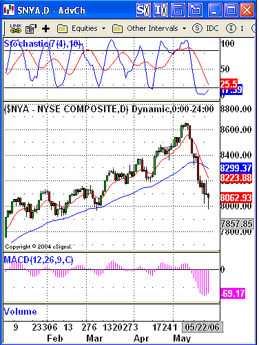
| FIGURE 1: NEW YORK STOCK EXCHANGE, DAILY. The long lower "tails" (or "shadows" or "wicks") on the candlesticks of recent trading sessions in the NYSE suggests a market that is running out of steam to the downside. Support is being created at these lows. |
| Graphic provided by: eSignal. |
| |
| As it turned out, we got the breakout but failed to reach the minimum upside projection of 1332. Instead, the S&P 500 rallied to a closing high of about 1325 (roughly 10 points above the breakout level) on March 3, before reversing and—eventually—turning into the nasty selloff that has panicked bulls and emboldened bears over the past several days. (See Figure 1.) The selling in the S&P 500 has been significant. In fact, as I suggested recently to a reporter from The Montreal Gazette, the long-term trend from the autumn 2002–spring 2003 lows was challenged (the trendline from the March 2003 lows, for example, to the highest low in October 2005 was broken by the recent selloff). This was also a selloff that took out a number of previous "lesser" lows in April, March, and (on an intraday basis) February. |
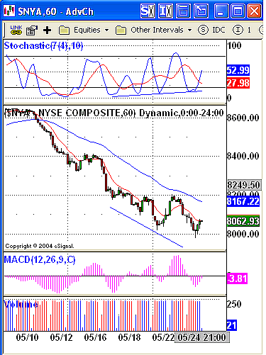
| However, into every significant selloff a little bounce must come. And figuring out when that bounce is coming—a bounce likely to be fueled in large part by short-covering—is instrumental both for traders looking to "rent" a stock for some quick profits to the upside, as well as for traders looking for shorting candidates when that bounce rolls over and the market moves on to test the lows of the recent correction. Hourly charts can be especially helpful in this regard. Often, patterns that have not yet materialized—or even patterns that will remain incomplete—on daily charts sometimes are significantly more coherent and realized in hourly charts of the same market. For example, in looking at the prospects for an "oversold bounce" in the New York Stock Exchange, I turned to an hourly chart of the $NYA and spotted a running positive stochastic divergence that—along with trends in the MACD histogram—suggested that a bounce for stocks might be imminent. |

|
| FIGURE 2: NEW YORK STOCK EXCHANGE, HOURLY. The pattern of higher lows in the stochastic is an unmistakable sign of a market that has lost a great deal of downside momentum. A similar pattern in the MACD histogram also suggests that the next significant movement in the NYSE will be upward. |
| Graphic provided by: eSignal. |
| |
| The hourly chart of the NYSE in Figure 2 shows clearly the pattern of higher lows in the stochastic—a pattern that, when accompanied by a pattern of lower lows in price, creates a positive divergence and the likelihood that the market will reverse at least temporarily to the upside. In this case, the positive stochastic divergence is buttressed by a positive divergence in the moving average convergence/divergence (MACD) histogram. While there are instances (daily charts) when I prefer divergences suggested by the stochastic, and other instances (weekly charts) when I prefer divergences suggested by the MACD histogram, I believe a speculator can approach a market with cautious optimism when both the stochastic and the MACD histogram have developed positive divergences after a significant correction. |
| What sort of upside can traders expect from any bounce in the NYSE? This will be an important bounce. The stocks that lead it will be scrutinized for the potential to provide broader market leadership—and those stocks that do not participate in it, or do so only anemically, will find themselves marked with the trading equivalent of the scarlet letter (a scarlet "S" for "sell" or "short," perhaps?). A swing rule–based target suggests that the NYSE could rally some 200 points beyond the resistance at 8200 (resistance created by a previous rally attempt) to test resistance at 8400 from mid-May. Interestingly enough, a rally or bounce to 8400 would represent a Fibonacci level of 61.8% retracement of the decline from the top in early May. |
Technical Writer for Technical Analysis of STOCKS & COMMODITIES magazine, Working-Money.com, and Traders.com Advantage.
| Title: | Technical Writer |
| Company: | Technical Analysis, Inc. |
| Address: | 4757 California Avenue SW |
| Seattle, WA 98116 | |
| Phone # for sales: | 206 938 0570 |
| Fax: | 206 938 1307 |
| Website: | www.Traders.com |
| E-mail address: | DPenn@traders.com |
Traders' Resource Links | |
| Charting the Stock Market: The Wyckoff Method -- Books | |
| Working-Money.com -- Online Trading Services | |
| Traders.com Advantage -- Online Trading Services | |
| Technical Analysis of Stocks & Commodities -- Publications and Newsletters | |
| Working Money, at Working-Money.com -- Publications and Newsletters | |
| Traders.com Advantage -- Publications and Newsletters | |
| Professional Traders Starter Kit -- Software | |
Click here for more information about our publications!
Comments
Date:�05/25/06Rank:�5Comment:�
Date:�05/25/06Rank:�3Comment:�

Request Information From Our Sponsors
- StockCharts.com, Inc.
- Candle Patterns
- Candlestick Charting Explained
- Intermarket Technical Analysis
- John Murphy on Chart Analysis
- John Murphy's Chart Pattern Recognition
- John Murphy's Market Message
- MurphyExplainsMarketAnalysis-Intermarket Analysis
- MurphyExplainsMarketAnalysis-Visual Analysis
- StockCharts.com
- Technical Analysis of the Financial Markets
- The Visual Investor
- VectorVest, Inc.
- Executive Premier Workshop
- One-Day Options Course
- OptionsPro
- Retirement Income Workshop
- Sure-Fire Trading Systems (VectorVest, Inc.)
- Trading as a Business Workshop
- VectorVest 7 EOD
- VectorVest 7 RealTime/IntraDay
- VectorVest AutoTester
- VectorVest Educational Services
- VectorVest OnLine
- VectorVest Options Analyzer
- VectorVest ProGraphics v6.0
- VectorVest ProTrader 7
- VectorVest RealTime Derby Tool
- VectorVest Simulator
- VectorVest Variator
- VectorVest Watchdog
