

HOT TOPICS LIST
- MACD
- Fibonacci
- RSI
- Gann
- ADXR
- Stochastics
- Volume
- Triangles
- Futures
- Cycles
- Volatility
- ZIGZAG
- MESA
- Retracement
- Aroon
INDICATORS LIST
LIST OF TOPICS
PRINT THIS ARTICLE
by David Penn
Contracting Bollinger Bands on a weekly chart of the 10-year note yield suggest the potential for greater volatility in the near term.
Position: N/A
David Penn
Technical Writer for Technical Analysis of STOCKS & COMMODITIES magazine, Working-Money.com, and Traders.com Advantage.
PRINT THIS ARTICLE
BOLLINGER BANDS
Bollinger Bands Grow Tighter
11/07/05 01:57:52 PMby David Penn
Contracting Bollinger Bands on a weekly chart of the 10-year note yield suggest the potential for greater volatility in the near term.
Position: N/A
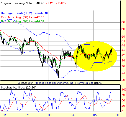
| "And I hope it's a sweet ride Here for me tonight Cause I feel I'm go-ing Feel I'm slow-ing. Down." --Soundgarden, "Tighter and Tighter" Having written so much about breakouts of Bollinger Bands in recent weeks, it is interesting to turn to a weekly chart of the 10-year Treasury note yield ($TNX) (Figure 1) and find the most important technical feature of that chart to be Bollinger Bands that are not only largely containing price action, but appear to be constricting it. |
| Of course, it is price that is constricting the Bollinger Bands, not the other way around. But a sense of the Bollinger Bands growing tighter in this weekly chart might be helpful in imagining what the end result of this tightening is likely to be: namely, an explosive move to the upside or downside, taking $TNX toward 5% or back down below 4%. |
|
| FIGURE 1: WEEKLY 10-YEAR TREASURY NOTE YIELD. Bollinger Bands that are becoming increasingly narrow contain the range-bound yield of the 10-year Treasury note. Tightening Bollinger Bands are often a sign that volatility may be dropping below normal, or historical levels. As such, a return to normal volatility -- and perhaps an explosive return -- is something that traders should be wary of. |
| Graphic provided by: Prophet Financial, Inc. |
| |
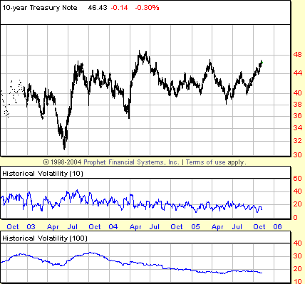
Writing his excellent technical analysis primer, The Visual Investor, John Murphy notes the following about Bollinger Bands:The Bollinger bands ... are constantly contracting and expanding in order to adjust to market volatility. Volatility refers to the degree of movement in prices. The bands will contract during periods of low volatility and expand during periods of high volatility. You can track the width of the bands to determine market volatility. Unusually narrow bands (reflecting low volatility and a quiet market) are usually followed by a period of high volatility (rapid and substantial price moves) ... The decrease in volatility can also be seen plainly in Figure 2, which includes historical volatility in both 10-day and 100-day studies. In both instances, historical volatility has been trending downward since late in the third quarter of 2003. |
|
| FIGURE 2: DAILY 10-YEAR TREASURY NOTE YIELD. Since the top of the spike in $TNX from the summer of 2003, historical volatilities in both 10-day and 100-day increments have been trending decidedly downward. |
| Graphic provided by: Prophet Financial, Inc. |
| |
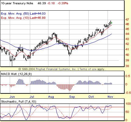
| It is important to remember that any near-term "period of high volatility" could be to the downside as well as the upside. Volatility means just that. Nevertheless, traders have an abundance of other tools that can be used to anticipate the direction of any break in prices -- to say nothing of methods that will allow them to swiftly join the directional party as soon as prices make their intentions clear. |
|
| FIGURE 3: DAILY 10-YEAR TREASURY NOTE YIELD. The abundance of positive MACD histogram bars in the autumn of 2005 suggest that $TNX�s course marks the path of least resistance. The fact that the 10-day EMA (in red) remains relatively close to trailing lows suggests that the $TNX has yet to become especially overextended to the upside. |
| Graphic provided by: Prophet Financial, Inc. |
| |
| Although increasingly ripe for a pullback, the $TNX in the daily chart in Figure 3 may be overbought, but not necessarily so overextended to demand a dramatic correction or pullback. While pulling away from the 50-day EMA, the fact that the 10-day EMA continues to provide support just beneath the lows as the market moves higher is supportive. Even if $TNX did pull back, there is reason to believe that such a pullback would be contained by support near the 44 (or 4.4%) level. This level marks both the early August peak of the rally that began in June, as well as the pullback low during the brief correction in mid-October. |
Technical Writer for Technical Analysis of STOCKS & COMMODITIES magazine, Working-Money.com, and Traders.com Advantage.
| Title: | Technical Writer |
| Company: | Technical Analysis, Inc. |
| Address: | 4757 California Avenue SW |
| Seattle, WA 98116 | |
| Phone # for sales: | 206 938 0570 |
| Fax: | 206 938 1307 |
| Website: | www.Traders.com |
| E-mail address: | DPenn@traders.com |
Traders' Resource Links | |
| Charting the Stock Market: The Wyckoff Method -- Books | |
| Working-Money.com -- Online Trading Services | |
| Traders.com Advantage -- Online Trading Services | |
| Technical Analysis of Stocks & Commodities -- Publications and Newsletters | |
| Working Money, at Working-Money.com -- Publications and Newsletters | |
| Traders.com Advantage -- Publications and Newsletters | |
| Professional Traders Starter Kit -- Software | |
Click here for more information about our publications!
Comments
Date:�11/07/05Rank:�4Comment:�
Date:�11/09/05Rank:�3Comment:�
Date:�08/04/06Rank:�5Comment:�Very clear and informative.

Request Information From Our Sponsors
- StockCharts.com, Inc.
- Candle Patterns
- Candlestick Charting Explained
- Intermarket Technical Analysis
- John Murphy on Chart Analysis
- John Murphy's Chart Pattern Recognition
- John Murphy's Market Message
- MurphyExplainsMarketAnalysis-Intermarket Analysis
- MurphyExplainsMarketAnalysis-Visual Analysis
- StockCharts.com
- Technical Analysis of the Financial Markets
- The Visual Investor
- VectorVest, Inc.
- Executive Premier Workshop
- One-Day Options Course
- OptionsPro
- Retirement Income Workshop
- Sure-Fire Trading Systems (VectorVest, Inc.)
- Trading as a Business Workshop
- VectorVest 7 EOD
- VectorVest 7 RealTime/IntraDay
- VectorVest AutoTester
- VectorVest Educational Services
- VectorVest OnLine
- VectorVest Options Analyzer
- VectorVest ProGraphics v6.0
- VectorVest ProTrader 7
- VectorVest RealTime Derby Tool
- VectorVest Simulator
- VectorVest Variator
- VectorVest Watchdog