HOT TOPICS LIST
- MACD
- Fibonacci
- RSI
- Gann
- ADXR
- Stochastics
- Volume
- Triangles
- Futures
- Cycles
- Volatility
- ZIGZAG
- MESA
- Retracement
- Aroon
INDICATORS LIST
LIST OF TOPICS
PRINT THIS ARTICLE
by Jason Braswell
As of late, discussion about the Standard & Poor's 500 index has been rife with citations from THE STOCK TRADER'S ALMANAC that cede 2005 to the bears based on its poor January performance. Unfortunately, articles also tell of the great returns of all the years ending in "5," leaving it unclear as to where the market should go. Instead of wrangling over the myriad statistics, let's look at the charts and see what trade opportunities appear.
Position: Hold
Jason Braswell
Jason Braswell is the Director of Risk Management Services for Infinite Consulting, LLC. He attended graduate school for mathematics at the University of Florida in Gainesville and is an MTA affiliate.
PRINT THIS ARTICLE
MACD
The S&P 500 Nears A Major Decision Point
03/04/05 04:21:45 PMby Jason Braswell
As of late, discussion about the Standard & Poor's 500 index has been rife with citations from THE STOCK TRADER'S ALMANAC that cede 2005 to the bears based on its poor January performance. Unfortunately, articles also tell of the great returns of all the years ending in "5," leaving it unclear as to where the market should go. Instead of wrangling over the myriad statistics, let's look at the charts and see what trade opportunities appear.
Position: Hold
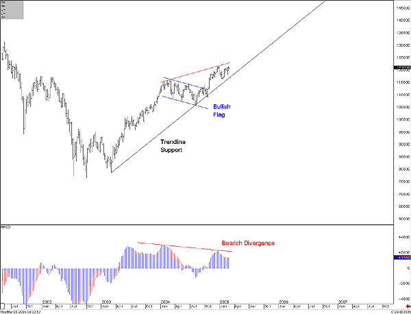
| The end of 2004 held promise for the Standard & Poor's 500 in 2005. Looking at the weekly chart below (Figure 1), price broke upward out of what appeared to be a clean bullish flag, signaling the end of a period of consolidation and the continuation of the prior uptrend. Using the half-mast rule of thumb for these patterns, we would have expected this to vault the S&P toward its 2000 highs. |
| However, the now-mature negative divergences between price and some major indicators -- one of which, the moving average convergence/divergence (MACD) histogram, is shown here -- look to extend the early weakness of 2005 and provide great setups for shorting this market. The key here is to see if we get a corresponding signal in price. In this case, the index is setting right atop a trendline that begins near the 2003 lows. If price breaks up under this trendline, the combination of the signals in both the oscillators and the index make this market a sell. It should be noted that the index is currently very near its 1217 high set on January 3, the second peak in the divergence. If we take out that high, traders and investors should wait on the sidelines to see if this divergence will carry through. Since this prior high will intersect our trendline by early May, we shouldn't have to wait too long for a signal in one direction or the other. |

|
| Figure 1: Weekly S&P 500. The end of 2004 held promise for the S&P in 2005. Looking at the weekly chart, price broke upward out of what appeared to be a clean bullish flag, signaling the end of a period of consolidation and the continuation of the prior uptrend. |
| Graphic provided by: CQG Net. |
| |
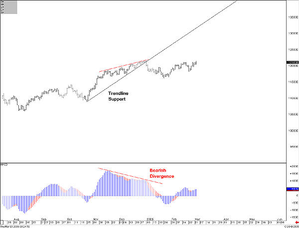
Such a move down may have far-reaching effects, as the received view is that a failed price pattern is more dependable than the pattern itself. Hence, if our trendline gives way, and the ensuing move down takes us to the bottom of our putative flag pattern, we might be in for a more serious downturn. Figure 2: S&P 500, daily chart. Note that the daily chart echoes the monthly. |
| It is also worth noting, if you take a look at the shorter term, the daily chart (Figure 2) echoes the monthly chart, and in fact, we can see almost exactly the same trade opportunity appeared on this chart after the first trading day of 2005. Developing divergence warned of possible weakness, and the break below trendline support gave us the price signal we needed to trade. Hence, look for the market to possibly bear out its fractal nature over the next few months as the longer-term chart follows suit. |
Jason Braswell is the Director of Risk Management Services for Infinite Consulting, LLC. He attended graduate school for mathematics at the University of Florida in Gainesville and is an MTA affiliate.
| Company: | Infinite Consulting, LLC |
| Website: | www.infiniteconsulting.org |
| E-mail address: | jbraswell@infiniteconsulting.org |
Traders' Resource Links | |
| Infinite Consulting, LLC has not added any product or service information to TRADERS' RESOURCE. | |
Click here for more information about our publications!
Comments
Date:�03/07/05Rank:�3Comment:�
Date:�03/08/05Rank:�4Comment:�
Date:�03/15/05Rank:�4Comment:�

Request Information From Our Sponsors
- VectorVest, Inc.
- Executive Premier Workshop
- One-Day Options Course
- OptionsPro
- Retirement Income Workshop
- Sure-Fire Trading Systems (VectorVest, Inc.)
- Trading as a Business Workshop
- VectorVest 7 EOD
- VectorVest 7 RealTime/IntraDay
- VectorVest AutoTester
- VectorVest Educational Services
- VectorVest OnLine
- VectorVest Options Analyzer
- VectorVest ProGraphics v6.0
- VectorVest ProTrader 7
- VectorVest RealTime Derby Tool
- VectorVest Simulator
- VectorVest Variator
- VectorVest Watchdog
- StockCharts.com, Inc.
- Candle Patterns
- Candlestick Charting Explained
- Intermarket Technical Analysis
- John Murphy on Chart Analysis
- John Murphy's Chart Pattern Recognition
- John Murphy's Market Message
- MurphyExplainsMarketAnalysis-Intermarket Analysis
- MurphyExplainsMarketAnalysis-Visual Analysis
- StockCharts.com
- Technical Analysis of the Financial Markets
- The Visual Investor
