

HOT TOPICS LIST
- MACD
- Fibonacci
- RSI
- Gann
- ADXR
- Stochastics
- Volume
- Triangles
- Futures
- Cycles
- Volatility
- ZIGZAG
- MESA
- Retracement
- Aroon
INDICATORS LIST
LIST OF TOPICS
PRINT THIS ARTICLE
by Gary Grosschadl
The Andrews Pitchfork technique shows this stock hitting a milestone on this chart.
Position: Hold
Gary Grosschadl
Independent Canadian equities trader and technical analyst based in Peterborough
Ontario, Canada.
PRINT THIS ARTICLE
ANDREWS PITCH-FORK
Microsoft's Pitchfork Challenge
07/01/04 09:18:47 AMby Gary Grosschadl
The Andrews Pitchfork technique shows this stock hitting a milestone on this chart.
Position: Hold
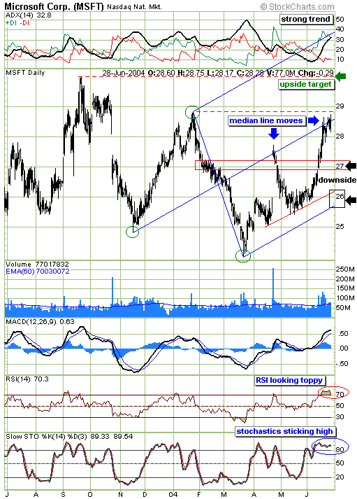
| Another way of displaying support and resistance comes from a chart technique that uses prominent pivot points to draw a "pitchfork," also called the Andrews Line, after the originator Alan Andrews. Drawing these charts is part art and part science as the "correct" pivot points must be chosen and the chart in the end has to look right. This can be said of most charts when choosing the most appropriate trendlines and pattern reading. One of the mainstays of pitchfork theory is that a move off the lower trendline (called the lower median line) has an 80% chance of reaching the median (center) line if the chart is valid. In this daily chart, using the three pivot points (circled in green), there have been two successful thrusts to the median line. But what happens next? |
| There are three possibilities. The stock could continue tracking along the median line for the time being, a bold move up might occur, or it could retrace to downside targets. A bold upside break has two likely targets: the previous high of $30 from last September and a more bullish target of the upper median line in the $32 area. Possible downside targets are $27 (relating to previous gaps and a congestion zone) and the $26 area (relating to a minor trendline and the lower median line). The pitchfork view in the bigger picture has a bullish uptrend intact as long as the lower median line is not violated (i.e. a sustained move below could signal a bearish trend reversal). |
|
| Microsoft's daily chart with a pitchfork view. |
| Graphic provided by: Stockcharts.com. |
| |
| Several indicators also offer clues. The directional movement indicator (DMI) at the top of the chart, is composed of three parts -- the ADX component (indicating trend strength), which shows a strong trend in place, rising above 30. The MACD (moving averge convergence/divergence) is still in bullish mode as long as the thicker MACD line stays above the thinner signal line. A crossover would be a bearish signal. The RSI is looking toppy, turning down from above 70. Meanwhile the stochastics indicator is "sticking" high in the overbought region above 80. If trend strength remains strong and the ADX keeps climbing, then stochastics can stay overbought for a longer period as is happening now. |
| In summary, the current trend is bullish but a downleg could occur to test the downside targets as mentioned. Short-term traders might want to consider drawing in a parallel line midway between the median line and the lower trendline. Violation of this line could give these traders an early sell indication in anticipation of a lower test. |
Independent Canadian equities trader and technical analyst based in Peterborough
Ontario, Canada.
| Website: | www.whatsonsale.ca/financial.html |
| E-mail address: | gwg7@sympatico.ca |
Click here for more information about our publications!
Comments

Request Information From Our Sponsors
- StockCharts.com, Inc.
- Candle Patterns
- Candlestick Charting Explained
- Intermarket Technical Analysis
- John Murphy on Chart Analysis
- John Murphy's Chart Pattern Recognition
- John Murphy's Market Message
- MurphyExplainsMarketAnalysis-Intermarket Analysis
- MurphyExplainsMarketAnalysis-Visual Analysis
- StockCharts.com
- Technical Analysis of the Financial Markets
- The Visual Investor
- VectorVest, Inc.
- Executive Premier Workshop
- One-Day Options Course
- OptionsPro
- Retirement Income Workshop
- Sure-Fire Trading Systems (VectorVest, Inc.)
- Trading as a Business Workshop
- VectorVest 7 EOD
- VectorVest 7 RealTime/IntraDay
- VectorVest AutoTester
- VectorVest Educational Services
- VectorVest OnLine
- VectorVest Options Analyzer
- VectorVest ProGraphics v6.0
- VectorVest ProTrader 7
- VectorVest RealTime Derby Tool
- VectorVest Simulator
- VectorVest Variator
- VectorVest Watchdog