HOT TOPICS LIST
- MACD
- Fibonacci
- RSI
- Gann
- ADXR
- Stochastics
- Volume
- Triangles
- Futures
- Cycles
- Volatility
- ZIGZAG
- MESA
- Retracement
- Aroon
INDICATORS LIST
LIST OF TOPICS
PRINT THIS ARTICLE
by David Penn
An extremely high MACD histogram in the weekly chart of the ten-year Treasury note yields back in August suggests that rates are going significantly higher.
Position: N/A
David Penn
Technical Writer for Technical Analysis of STOCKS & COMMODITIES magazine, Working-Money.com, and Traders.com Advantage.
PRINT THIS ARTICLE
MACD
Treasury Yields And MACD Histogram Peaks
01/06/04 10:24:17 AMby David Penn
An extremely high MACD histogram in the weekly chart of the ten-year Treasury note yields back in August suggests that rates are going significantly higher.
Position: N/A
| I've been increasingly interested in the MACD histogram. There are a number of popular and effective uses for the histogram -- including looking for divergences between price action and peaks and troughs in the indicator, which is often regarded as the most powerful way to exploit the histogram. However, there is an interesting wrinkle in the MACD histogram that should be of interest to those who include it among their preferred trading tools, a wrinkle that might help both traders and investors plan for longer-term changes in the important interest rate market. |
Note what Alexander Elder, author of Trading for a Living and Come Into My Trading Room, has to say about the MACD histogram:"A record peak for the past three months in daily MACD-Histogram shows that bulls are very strong and prices are likely to rise even higher. A record new low for MACD-Histogram for the past three months shows that lower prices are likely ahead." |

|
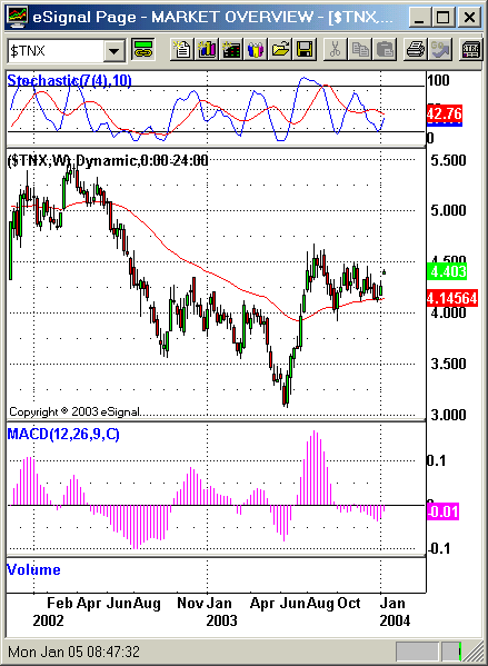
| A breakout above the August 2003 high in the $TNX could send 10-year Treasury yields to 6%. |
| Graphic provided by: eSignal. |
| |
| This might seem to go against common sense. Wouldn't an extremely high MACD histogram peak, for example, almost inevitably produce a subsequent lower MACD high? And wouldn't such a development likely lead to a negative divergence between price action in a rising market (i.e., a MACD histogram that has a higher high then a lower high compared price action that displayed a high and then a higher high). However, this common sense belies a lack of understanding about how the histogram works and how, even though the MACD histogram can be used as an oscillator, the MACD histogram has unique qualities of its own. Consider the chart of the weekly 10-year Treasury yield, as represented by $TNX. Yields have been in a dedicated bear market since the earliest days of 2000, falling from 6.8% to nearly 3% by the summer of 2003. Since the summer of 2003, yields (or rates) moved up sharply to near 4.5% before settling into a range between, roughly, 4% and 4.4%. |
| Note that it was during this period, August 2003 in specific, that the MACD histogram made its extreme highs. Not only do these highs represent Elder's "record peak for the past three months," but also this peak is a record going back to at least 1997, if not further. While Elder's comments were specifically referring to daily histogram values, he does stress elsewhere that weekly MACD signals tend to be stronger than daily ones. This suggests to me that the potential for higher values -- in the case of $TNX, higher interest rates -- are increasingly likely going forward. |
| It is also worth noting that as prices retreated from the August highs, they did find significant support on the 50-week exponential moving average. Given the fact that $TNX was moving up from what were record lows in June 2003, this is an additionally bullish sign for ten-year yields. The stochastic (7,10) not only shows the market to be oversold, but also there is what Linda Bradford Raschke in her book, Street Smarts, calls a "hook." This "hook" is another signal that the declining stochastic is likely to reverse and head higher, auguring higher values for the $TNX. |
Technical Writer for Technical Analysis of STOCKS & COMMODITIES magazine, Working-Money.com, and Traders.com Advantage.
| Title: | Technical Writer |
| Company: | Technical Analysis, Inc. |
| Address: | 4757 California Avenue SW |
| Seattle, WA 98116 | |
| Phone # for sales: | 206 938 0570 |
| Fax: | 206 938 1307 |
| Website: | www.Traders.com |
| E-mail address: | DPenn@traders.com |
Traders' Resource Links | |
| Charting the Stock Market: The Wyckoff Method -- Books | |
| Working-Money.com -- Online Trading Services | |
| Traders.com Advantage -- Online Trading Services | |
| Technical Analysis of Stocks & Commodities -- Publications and Newsletters | |
| Working Money, at Working-Money.com -- Publications and Newsletters | |
| Traders.com Advantage -- Publications and Newsletters | |
| Professional Traders Starter Kit -- Software | |
Click here for more information about our publications!
Comments

Request Information From Our Sponsors
- StockCharts.com, Inc.
- Candle Patterns
- Candlestick Charting Explained
- Intermarket Technical Analysis
- John Murphy on Chart Analysis
- John Murphy's Chart Pattern Recognition
- John Murphy's Market Message
- MurphyExplainsMarketAnalysis-Intermarket Analysis
- MurphyExplainsMarketAnalysis-Visual Analysis
- StockCharts.com
- Technical Analysis of the Financial Markets
- The Visual Investor
- VectorVest, Inc.
- Executive Premier Workshop
- One-Day Options Course
- OptionsPro
- Retirement Income Workshop
- Sure-Fire Trading Systems (VectorVest, Inc.)
- Trading as a Business Workshop
- VectorVest 7 EOD
- VectorVest 7 RealTime/IntraDay
- VectorVest AutoTester
- VectorVest Educational Services
- VectorVest OnLine
- VectorVest Options Analyzer
- VectorVest ProGraphics v6.0
- VectorVest ProTrader 7
- VectorVest RealTime Derby Tool
- VectorVest Simulator
- VectorVest Variator
- VectorVest Watchdog
