HOT TOPICS LIST
- MACD
- Fibonacci
- RSI
- Gann
- ADXR
- Stochastics
- Volume
- Triangles
- Futures
- Cycles
- Volatility
- ZIGZAG
- MESA
- Retracement
- Aroon
INDICATORS LIST
LIST OF TOPICS
PRINT THIS ARTICLE
by David Penn
This bullish chart pattern suggests new 52-week highs in the Nasdaq in the near term.
Position: N/A
David Penn
Technical Writer for Technical Analysis of STOCKS & COMMODITIES magazine, Working-Money.com, and Traders.com Advantage.
PRINT THIS ARTICLE
An Intraday Nasdaq Head And Shoulders Bottom
12/16/03 11:35:22 AMby David Penn
This bullish chart pattern suggests new 52-week highs in the Nasdaq in the near term.
Position: N/A
| While it cannot be doubted that looking at longer term charts (such as weekly for daily traders) can be helpful for putting a given market in a wider context, it is no less true that looking at charts of shorter duration (such as hourly or half-hourly for daily traders) can help in understanding the inner workings of a market that is ready to move. |
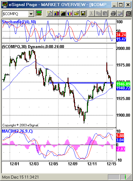
| The formation size of this head and shoulders bottom is approximately 60 points, from 1950 to 1890. Given this, an upside to 2010, which would represent a new 52-week high in the Nasdaq. It is interesting to see that this intraday head and shoulders bottom, on a daily chart, looks like a hammer. The hammer is a Japanese candlestick formation that develops at the bottom of a downtrend, and consists of a small "real body" and a long lower shadow. The appearance of this candlestick at this point in a downtrend that lasted for seven days was bullish. That the downtrend had engaged the 50-day exponential moving average also sets up the possibility that the Nasdaq would find support at this level--as it had on four other occasions since the late-July 2003 correction. |

|
| Figure 1: The right shoulder of this head and shoulders bottom is built on a breakout above the 50 30-minute bar exponential moving average. |
| Graphic provided by: eSignal. |
| |
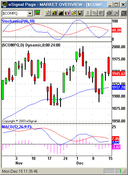
| The indicators also show two additional reasons for bullishness at this time. The stochastic oscillator (7, 10) began the month of December at quite overbought levels and spent the first trading weeks of the month selling off from these levels. However, by the 10th of December the %K line ("fast line") turned up and by the following day was moving strongly and swiftly back up. While the %K line has yet to crossover the slower %D line, the bullishness of this movement from the oversold levels of the 10th and 11th cannot be denied. |
 Figure 2: Note the rising MACD histogram and the "curling up" of the stochastic oscillator's "fast line." I have also been paying more attention to the daily MACD histogram. While even those who are fans of the MACD histogram are at times hesitant to rely on the histogram on a daily basis (preferring its use on weekly charts), I still am finding it to be--when used with other indicators such as the stochastic, as well as moving averages such as the 50-day, Japanese candlesticks and other methods--a worthwhile tool in determining when pullbacks in bull markets may have run their course. Here, I look for a spike low in the MACD histogram and then a follow-up shallower bar as a hint that the pullback might be over and a resumption of the uptrend at hand. |
| I've thought of this formation as the "Gore Endorses Dean" pullback in the overall bullish trend the market has enjoyed, at least, since March 2003 (the Nasdaq has been in a bull market since October 2002). Note that, from a sociologic perspective, a rising market represents a positive for the incumbent President and a falling market a negative. Thus, it is little surprise that an announcement that represents a certain "firming" of the opposition to the incumbent comes on the sixth day of a seven-day pullback from recent highs. |
Technical Writer for Technical Analysis of STOCKS & COMMODITIES magazine, Working-Money.com, and Traders.com Advantage.
| Title: | Technical Writer |
| Company: | Technical Analysis, Inc. |
| Address: | 4757 California Avenue SW |
| Seattle, WA 98116 | |
| Phone # for sales: | 206 938 0570 |
| Fax: | 206 938 1307 |
| Website: | www.Traders.com |
| E-mail address: | DPenn@traders.com |
Traders' Resource Links | |
| Charting the Stock Market: The Wyckoff Method -- Books | |
| Working-Money.com -- Online Trading Services | |
| Traders.com Advantage -- Online Trading Services | |
| Technical Analysis of Stocks & Commodities -- Publications and Newsletters | |
| Working Money, at Working-Money.com -- Publications and Newsletters | |
| Traders.com Advantage -- Publications and Newsletters | |
| Professional Traders Starter Kit -- Software | |
Click here for more information about our publications!
Comments
Date:�12/16/03Rank:�5Comment:�
Date:�12/19/03Rank:�3Comment:�

Request Information From Our Sponsors
- StockCharts.com, Inc.
- Candle Patterns
- Candlestick Charting Explained
- Intermarket Technical Analysis
- John Murphy on Chart Analysis
- John Murphy's Chart Pattern Recognition
- John Murphy's Market Message
- MurphyExplainsMarketAnalysis-Intermarket Analysis
- MurphyExplainsMarketAnalysis-Visual Analysis
- StockCharts.com
- Technical Analysis of the Financial Markets
- The Visual Investor
- VectorVest, Inc.
- Executive Premier Workshop
- One-Day Options Course
- OptionsPro
- Retirement Income Workshop
- Sure-Fire Trading Systems (VectorVest, Inc.)
- Trading as a Business Workshop
- VectorVest 7 EOD
- VectorVest 7 RealTime/IntraDay
- VectorVest AutoTester
- VectorVest Educational Services
- VectorVest OnLine
- VectorVest Options Analyzer
- VectorVest ProGraphics v6.0
- VectorVest ProTrader 7
- VectorVest RealTime Derby Tool
- VectorVest Simulator
- VectorVest Variator
- VectorVest Watchdog
