HOT TOPICS LIST
- MACD
- Fibonacci
- RSI
- Gann
- ADXR
- Stochastics
- Volume
- Triangles
- Futures
- Cycles
- Volatility
- ZIGZAG
- MESA
- Retracement
- Aroon
INDICATORS LIST
LIST OF TOPICS
PRINT THIS ARTICLE
by Kevin Hopson
The U.S. Dollar Index has been in a decline for nearly three years now but various signs are pointing to a potential bounce in the near-term.
Position: Hold
Kevin Hopson
Kevin has been a technical analyst for roughly 10 years now. Previously, Kevin owned his own business and acted as a registered investment advisor, specializing in energy. He was also a freelance oil analyst for Orient Trading Co., a commodity futures trading firm in Japan. Kevin is currently a freelance writer.
PRINT THIS ARTICLE
WEDGE FORMATIONS
Is The U.S. Dollar Ready To Rebound?
12/08/03 02:03:07 PMby Kevin Hopson
The U.S. Dollar Index has been in a decline for nearly three years now but various signs are pointing to a potential bounce in the near-term.
Position: Hold
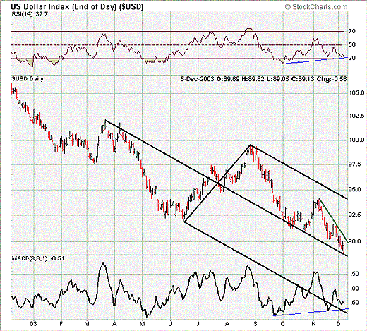
| If you look at a long-term chart of the U.S. Dollar Index ($USD), three years for example, you might come away speechless. Though I have only provided a one-year chart for the index, the two time periods resemble one another very closely. In other words, the index has been in a steep decline whether you look at a one-year, two-year or three-year chart. However, there are some positive short-term signs, which could indicate the potential for at least a temporary bottom in prices. |
| For example, notice how the relative strength index (RSI) and moving average convergence/divergence (MACD) have been moving higher despite a continued decline in prices. This is commonly known as a bullish divergence and tends to signal a forthcoming bottom. Also, you will notice that the black median line is once again coming into play. This trendline has supported prices since early fall and has kept the index in the upper channel of the pitchfork. |

|
| Graphic provided by: Stockcharts.com. |
| |
| If that is not enough, the index appears to be completing a falling wedge formation. This is illustrated by the green downtrend line and the black median line. Falling wedges are basically triangle formations that slope to the downside, with the trading range narrowing as time goes on. Since prices often move back in the opposite direction of a wedge, a falling wedge tends to be a bullish sign. As a result, when you take into account the other positives on the chart, a bottom reversal is possible in the near-term. |
Kevin has been a technical analyst for roughly 10 years now. Previously, Kevin owned his own business and acted as a registered investment advisor, specializing in energy. He was also a freelance oil analyst for Orient Trading Co., a commodity futures trading firm in Japan. Kevin is currently a freelance writer.
| Glen Allen, VA | |
| E-mail address: | hopson_1@yahoo.com |
Click here for more information about our publications!
Comments
Date:�12/09/03Rank:�4Comment:�
Date:�12/11/03Rank:�4Comment:�
Date:�12/14/03Rank:�4Comment:�
Date:�12/15/03Rank:�Comment:�The dollar decline appears to be in its 5th wave. The move up from June to September was the 4th wave. It is currently in the 3rd wave of the 5th wave down. The positive divergence is just a sign it is entering a 4th wave of the 5th wave down. We have yet to complete the 5th wave, which means the dollar will ultimately fall further - possibly to the 1992 low.
Date:�12/18/03Rank:�4Comment:�
Date:�12/29/03Rank:�5Comment:�

Request Information From Our Sponsors
- VectorVest, Inc.
- Executive Premier Workshop
- One-Day Options Course
- OptionsPro
- Retirement Income Workshop
- Sure-Fire Trading Systems (VectorVest, Inc.)
- Trading as a Business Workshop
- VectorVest 7 EOD
- VectorVest 7 RealTime/IntraDay
- VectorVest AutoTester
- VectorVest Educational Services
- VectorVest OnLine
- VectorVest Options Analyzer
- VectorVest ProGraphics v6.0
- VectorVest ProTrader 7
- VectorVest RealTime Derby Tool
- VectorVest Simulator
- VectorVest Variator
- VectorVest Watchdog
- StockCharts.com, Inc.
- Candle Patterns
- Candlestick Charting Explained
- Intermarket Technical Analysis
- John Murphy on Chart Analysis
- John Murphy's Chart Pattern Recognition
- John Murphy's Market Message
- MurphyExplainsMarketAnalysis-Intermarket Analysis
- MurphyExplainsMarketAnalysis-Visual Analysis
- StockCharts.com
- Technical Analysis of the Financial Markets
- The Visual Investor
