

HOT TOPICS LIST
- Strategies
- Stocks
- Buy
- Investing
- Brokers
- Psychology
- Interviews
- Accumulate
- Sell
- Hold
- Spotlight
- Websites
- Candlestick Corner
- Gold & Metals
- Options Trading
LIST OF TOPICS
TRADER'S NOTEBOOK
The Inflation Story: Separating Fact From Fiction
04/04/11 12:11:53 PM PSTby Matt Blackman
Policy makers would have us believe that inflation is contained and that deflation is the greater threat to our economy. Remembering the fate suffered by those who trusted policymakers' statistics and advice on the housing market in 2005 and 2006, is buying the official line now wise? This is a continuation of Matt Blackman's Traders.com Advantage article, "Getting Real On Inflation."
| In the latest Bureau of Labor Statistics Consumer Price Index news release on March 17, 2011, we learned that the CPI increased 2.1% in February over the year before. Further, core inflation (CPI less food and energy) was just 1.1%. Many investors and even some traders have taken these numbers to heart and stowed their inflation concerns safely in the cellar. But there are a number of reasons why such a sanguine approach has the potential to be hazardous to your financial well-being. THE RAISON D'ÊTRE In fact, the 26-month period from the midterm low (September) to the election-year high (November) has been responsible for 93% of all DJIA gains over the 104-year period compared to an anemic 7% for the 22 months from December of the election year to August of the midterm year (see the "Election Primer" article link under "Suggested reading"). It is a testament to the ability of the government to kick the economy into high gear leading up to each election, and the creative talents of government statisticians to paint lipstick on an otherwise unattractive economic pig. Governments have demonstrated they will do whatever it takes to get elected and keep the incumbent parties in power. This includes fudging the numbers such as CPI and unemployment and make them look more subdued than is reality while enhancing statistics such as GDP. I came to the conclusion a while ago that these statistics are little more than electioneering tools and should not be taken too seriously. |
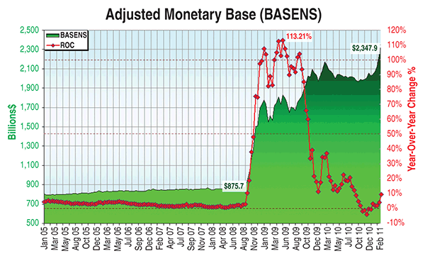
| STATS, STATS, AND MORE STATS We have already discussed the sharp increase in the adjusted monetary base, which is up an unprecedented 160% since September 2008 (Figure 1). Are we to believe that more than doubling the money in circulation has had a minimal inflation impact, as the Federal Reserve and Bureau of Labor Statistics have contended? And what about the more than 110% increase in the basket of commodities represented by the Commodity Research Bureau (CRB) index since December 2008? Is this, along with the meteoric rise in the prices of precious and industrial metals and other raw materials (like rubber and cotton), just a coincidence?
FIGURE 1: ADJUSTED MONETARY BASE. Here you see a biweekly chart showing adjusted monetary base (green) and the year-over-year rate of change in the money in circulation. Data -- St Louis Fed
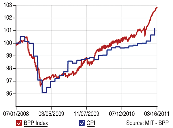
Here's the Massachusetts Institute of Technology's Billion Prices Project Daily Price Index (BPP), which tracks prices at thousands of retail outlets across the country and around the globe. The BPP index read 102.83 versus a daily CPI of 100.64 in late March and Figure 2 shows the growing discrepancy between the two.
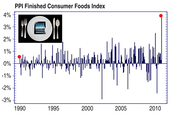
FIGURE 2: BILLION PRICES PROJECT DAILY PRICE INDEX. Note how reality is diverging from the CPI inflation measure. Source -- http://bpp.mit.edu/ Core inflation may be an interesting statistic to economists and to those who don't eat, drive, travel, or use plastic or other petroleum products, but it is of little use to anyone else. And as well as the growing number of food riots around the globe, there is increasing evidence that food prices are getting out of hand in this country as well. The Producer Price Index Finished Consumer Foods Index (Figure 3) is one example. In February, the index registered its largest monthly percentage jump since 1974.
FIGURE 3: HISTORIC CHART OF THE PPI FINISHED CONSUMER FOODS INDEX. This chart shows that we have had the biggest jump in food prices in 37 years. |
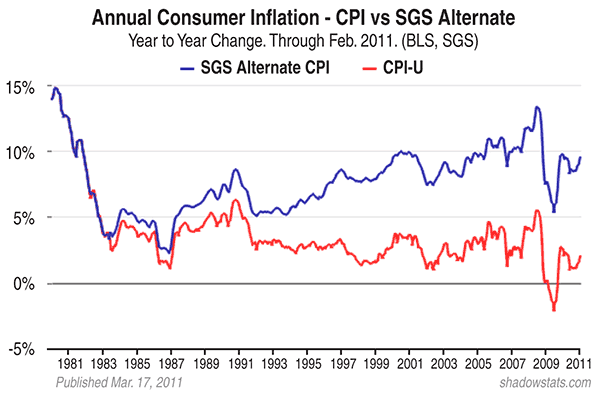
| As I mentioned in the Traders.com Advantage article "Getting Real On Inflation," according to the Purchaser's Price Finished Consumer Foods Index (PPI-FCFI), the index rose 3.9% in February, which works out to an annualized increase of 58%. Prices for finished goods have jumped 5.6% over the last year, according to the Producer Price Index. Food and energy components jumped 3.9% and 3.3%, respectively, in February alone. Readers interested in learning more about how government statisticians have modified official statistics, especially since the early 1980s, may want to watch Chris Martenson's Fuzzy Numbers video (see link in "Suggested reading"). It is an eye-opener. Further, John Williams, the host of Shadowstats.com, has tracked a number of government statistics and offers a comparison between how the numbers were originally calculated and how they are calculated today, thanks to the impact of such statistical tools as hedonics, substitution, and imputation to make the numbers more attractive. As Figure 4 shows, mathematical manipulations and other fudging have allowed government minions to produce a more favorable view of inflation that is much less disturbing than would have been the case had the statistics not been so drastically altered over the years. For example, according to Shadowstats.com, current CPI (inflation) is not 2.1%, but nearly 10%.
FIGURE 4: ACTUAL VS. SHADOW. Here you see the Consumer Price Index as it was calculated before all the changes post-1980 (blue) versus the current drastically ameliorated calculation. Chart -- www.shadowstats.com THE SMOKING GUN?
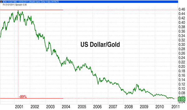
FIGURE 5: WEEKLY CHART OF THE US DOLLAR PRICED IN GOLD OVER THE LAST DECADE. The buck has dropped nearly 90% in value, which means in real terms, your dollar buys a lot less than it did 10 years ago. Since peaking in 1999, the Dow Jones Industrial Average priced in gold is still down more than 81% even after a 21% gain off the March 2009 bottom. Chart courtesy of www.genesisft.com |
| Have you ever wondered why politicians and central bankers downplay the importance of gold and other precious metals? The reason is simple -- any significant increase in metal prices reduces the confidence in our currency. Since 1971, when President Richard Nixon took the US dollar off the gold standard, the dollar is only as good as the ability of government policy makers (including the Federal Reserve) to convince consumers and producers of its worth. But if the history of fiat paper currencies is any guide, they are fighting a losing battle. Sooner or later, a fiat currency returns to its real value -- that of the paper upon which it is printed. PREVENTATIVE MEASURES First, interest rates will rise more rapidly than previously believed possible. Those who were around in the late 1970s and early 1980s experienced this firsthand. This will initially be good for stocks, but they began to feel the pinch as rates rose further. Raw commodities will also benefit in the early stages until the cost of money increases to a point that makes this investment unattractive. Rising commodity prices and costs of living are not being offset by rising incomes, and unemployment levels have remained elevated and incomes compressed so far. This is very different from the deflation scenario that the Fed endorses in which all prices fall. Deflationists convert to dollar-denominated assets such as bonds or Treasuries to protect themselves. Stagflationists, on the other hand, often revert to precious metals and nondollar-denominated assets to battle rising costs in high unemployment environment, at least in the initial stages. However, stocks eventually languish in both stagflation and deflation environments. Today, stocks are soaring as are commodities, especially food and fuel, a clear indication that inflation is gaining momentum. In this environment, precious metals and commodities will continue to outperform dollar-denominated assets such as bonds. Stocks will also do well until interest rates make the cost of money too prohibitive. Rising rates have the potential to either trigger stagflation if employment growth remains muted or full-blown inflation if policy makers are too slow in raising rates as the economy heats up. Perhaps most important of all is to maintain a realistic perspective and remember that governments and central bankers have a vested interest in maintaining the faith in our currency even as they take steps to debase it. Their actions speak far louder than words. As we learned in the wake of the housing crisis, blindly following the mainstream official statistics and advice can have tragic consequences. |
| SUGGESTED READING "Getting Real On Inflation" http://technical.traders.com/tradersonline/display.asp?art=5839 "Election Primer -- The Most Powerful Market Cycle?" "See The Latest Billion Prices Project Charts For The USA" PPI Finished Consumer Food Index Cleveland Federal Reserve PPI Website Chris Martenson's Video Course: Fuzzy Numbers |
Matt Blackman is a full-time technical and financial writer and trader. He produces corporate and financial newsletters, and assists clients in getting published in the mainstream media. He tweets about stocks he is watching at www.twitter.com/RatioTrade Matt has earned the Chartered Market Technician (CMT) designation.
| E-mail address: | indextradermb@gmail.com |
PRINT THIS ARTICLE

Request Information From Our Sponsors
- VectorVest, Inc.
- Executive Premier Workshop
- One-Day Options Course
- OptionsPro
- Retirement Income Workshop
- Sure-Fire Trading Systems (VectorVest, Inc.)
- Trading as a Business Workshop
- VectorVest 7 EOD
- VectorVest 7 RealTime/IntraDay
- VectorVest AutoTester
- VectorVest Educational Services
- VectorVest OnLine
- VectorVest Options Analyzer
- VectorVest ProGraphics v6.0
- VectorVest ProTrader 7
- VectorVest RealTime Derby Tool
- VectorVest Simulator
- VectorVest Variator
- VectorVest Watchdog
- StockCharts.com, Inc.
- Candle Patterns
- Candlestick Charting Explained
- Intermarket Technical Analysis
- John Murphy on Chart Analysis
- John Murphy's Chart Pattern Recognition
- John Murphy's Market Message
- MurphyExplainsMarketAnalysis-Intermarket Analysis
- MurphyExplainsMarketAnalysis-Visual Analysis
- StockCharts.com
- Technical Analysis of the Financial Markets
- The Visual Investor