HOT TOPICS LIST
- Strategies
- Stocks
- Buy
- Investing
- Brokers
- Psychology
- Interviews
- Accumulate
- Sell
- Hold
- Spotlight
- Websites
- Candlestick Corner
- Gold & Metals
- Options Trading
LIST OF TOPICS
CANDLESTICK CORNER
Candlestick Filtering
01/14/04 05:10:15 PM PSTby Ashwani Gujral
Getting the best of East and West.
| Candlestick charting signals can be used in conjunction with Western indicators and the results achieved might be better than using them individually. I will take nine candlestick patterns and identify them on a chart with a candlestick pattern scanning software, and then filter those signals with Western indicators and check their performance. I have limited the number of patterns to nine for ease of explanation. It is critical to understand the methodology; readers can increase the number of candlestick patterns and indicators in the study. This article is written from a trader's point of view and depicts how I use candlestick charting in my daily trading. I will avoid using statistics here because that can be read elsewhere from some of the literature available on candlesticks. I will also avoid the repetition of a description of all the reversal and continuation patterns available in candlestick charting.
ORIGINSFirst developed in 17th-century Japan for rice trading, candlestick charting consists of depicting price information in terms of hollow or white bodies or filled or black bodies with wicks at both ends. The white body is interpreted as the opening price of the session being below the closing price and the black body is interpreted as the opening price of the session being above the closing price of the session. The wicks at the top and bottom of the real bodies depict the high and low of the day. The major difference between the Western charts and the candlestick method is that the candlesticks give a clear view of market behavior both in terms of buying and selling activity in the market and in terms of indecisiveness or clear trend. Candlestick patterns often provide the trigger for the buying or selling decision once the Western indicators move to extreme overbought and oversold conditions. The indicators that the candle charts will be tested against are:
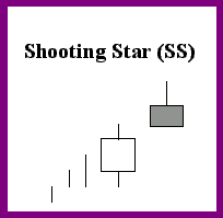
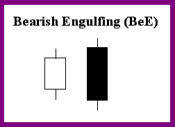
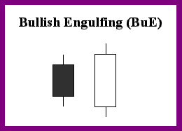
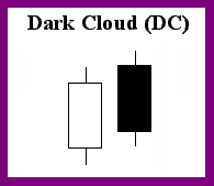
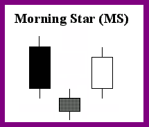
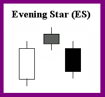
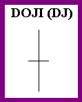
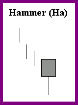
We will first go through the shapes and interpretations of the candle patterns that must be tested. This will allow us to determine whether a particular candle formation should be accepted or rejected. We will study both entries and exits into trends. All signals will be taken only when the indicators are in the extreme overbought or oversold territory. Ignore signals occurring in other conditions. We will avoid countertrend trades for this analysis. The main trend in all cases being considered is up. The various candle patterns with their shapes and interpretations can be seen in Figure 1.
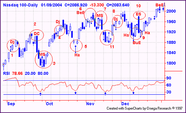
USING RSI WITH CANDLESTICKSFigure 2 is of the Nasdaq 100 daily scanned for the eight candlestick patterns along with the seven-period RSI. The oversold RSI in an uptrend provides low-risk entries into a trend. Candlestick patterns can be used to determine when the correction is over. By filtering the candle signals with the RSI, taking the signals appropriate with the market signals, we can avoid false signals. Readers should also remember that the RSI can be used as an oscillator, to trade overbought and oversold levels in a range-bound situation. Again, in this case the candle entry signals can be filtered by using the RSI. The circled numbers in the figure list the response for each candle signal received after filtering with the RSI.
The RSI 30 and 70 levels are considered overbought and oversold:
As is evident from this analysis, by using a combination of Western indicators and Japanese candlesticks, a number of false signals can be avoided. It is clear that returns can be bettered by a combination of both techniques. Further, all entries gained were true. Readers can use computers to do a similar analysis across a large number of stocks and compare the results with only the candlesticks and the RSI.
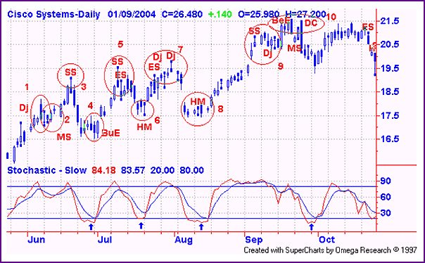
STOCHASTICS WITH CANDLESTICKSFigure 3 shows the daily chart of technology bellwether Cisco Systems (CSCO) with a slow stochastic with 7, 10 settings. The overbought and oversold levels in this case are 80, 20. The stochastic gives clear, sharp signals and is acknowledged by many as the indicator that works best with candlesticks. In this case, the stochastics are again used to take low-risk entries into the uptrend. Again, the signals here are taken when the stochastic is in extreme zones. Given here is each encircled candlestick pattern generated:
As we have now seen that the stochastic gives much cleaner signals than the RSI, it is my indicator of choice to use with candlesticks. All the major swings were caught using this technique. Numerical values of actual gain can be found by running a computer simulation.
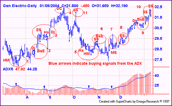
USING ADX WITH CANDLESTICKSThe daily chart of General Electric (GE) in Figure 4 shows the price chart with the ADX. Since the main trend of the GE stock is up, we take the ADX moving higher than the moving average (14-period) as a buy signal and moving lower as a consolidation signal.
As we all know, the ADX indicates the strength of the trend. An ADX above 30 and one rising above 20 indicate a strong trend. An ADX below 30 and one declining below 20 is, at best, consolidation. Given below are the filtered signals:
As we have seen, ADXR has also performed well with the candlesticks, particularly once it started trending. It did not let us get out of the trade. In addition, during the consolidation phase, it got most of the signals. ADX is one of the most useful indicators, and one whose importance is sometimes understated. ADX can be used in a variety of ways and is a true gauge of the trend strength. Once the market starts trending, putting it as a filter on the candlestick chart can ensure the trader just goes with the trend.
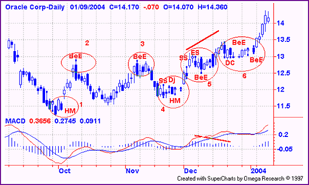
MACD WITH CANDLESTICKSThe daily chart of Oracle Corp. (ORCL) displayed in Figure 5 shows how to apply the MACD with candlesticks. The MACD is a great indicator in both trending and sideways markets. The MACD histogram is a good lead indicator to cycles of any size. The MACD can be used in conjunction with the candlesticks. The MACD signals a buy when the fast moving average (MA) crosses over the slow MA and signals a sell when the slow MA moves above the fast MA, but I like to use the histogram more than the moving averages because it leads price action.
Generally, whenever there is divergence between the price and histogram action, it's time for a reversal or a correction. The bigger the amplitude of the histogram cycles, the larger the price cycles. Now looking at the chart of Oracle, we see that there are a lot of swings in the price action. Let's see how many we can catch by filtering the candlestick signals with the MACD:
The MACD did not outperform, in terms of absolute returns, but it did manage to keep us out of trouble by keeping us out of false trades.
IN SUMMARYWith all four indicators, the numbers of trades were drastically reduced compared to results for candlestick patterns alone. Further, there was some improvement in the returns, as false trades were avoided. The methodology I have explained in this article can be programmed into a computer and it can be run across a number of stocks, but I doubt that the results would differ a great deal. The filtering of the candle signals gives great leading signals in extreme market conditions. They should always be used in conjunction with the Western indicators as filters, so that false signals can be eliminated.
Ashwani Gujral is a technical analyst, commentator, author, and trainer based in India. He follows both Indian and US markets. He is also an active short-term trader and money manager.
SUGGESTED READINGMorris, Greg L. [1995]. Candlestick Charting Explained: Timeless Techniques For Trading Stocks And Futures, Irwin Professional Publishing.SuperCharts (TradeStation Group)
Current and past articles from Working Money, The Investors' Magazine, can be found at Working-Money.com.
| |||||||||||||||||
PRINT THIS ARTICLE

Request Information From Our Sponsors
- VectorVest, Inc.
- Executive Premier Workshop
- One-Day Options Course
- OptionsPro
- Retirement Income Workshop
- Sure-Fire Trading Systems (VectorVest, Inc.)
- Trading as a Business Workshop
- VectorVest 7 EOD
- VectorVest 7 RealTime/IntraDay
- VectorVest AutoTester
- VectorVest Educational Services
- VectorVest OnLine
- VectorVest Options Analyzer
- VectorVest ProGraphics v6.0
- VectorVest ProTrader 7
- VectorVest RealTime Derby Tool
- VectorVest Simulator
- VectorVest Variator
- VectorVest Watchdog
- StockCharts.com, Inc.
- Candle Patterns
- Candlestick Charting Explained
- Intermarket Technical Analysis
- John Murphy on Chart Analysis
- John Murphy's Chart Pattern Recognition
- John Murphy's Market Message
- MurphyExplainsMarketAnalysis-Intermarket Analysis
- MurphyExplainsMarketAnalysis-Visual Analysis
- StockCharts.com
- Technical Analysis of the Financial Markets
- The Visual Investor

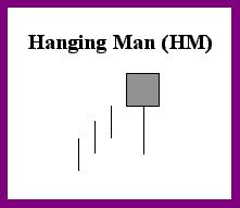 The hanging man is considered bullish because of the uptrend. The color is not important; could be bearish if the body is black and the next day opens lower.